
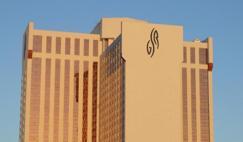
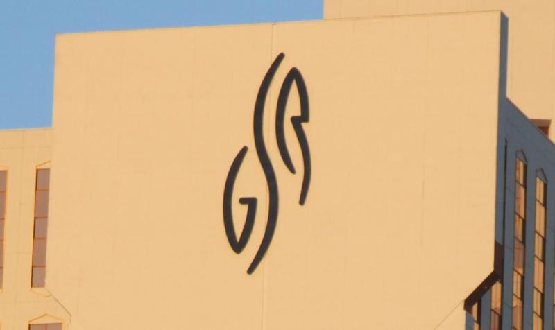
There’s been quite a debate over the new sign they put up on the Grand Sierra Resort (formerly the Reno Hilton). Stoney deGeyter said it’s too small for the building, and besides it’s such an abstract logo that it doesn’t make any sense when you glance at it from the freeway.
The comments range from agreeing on both counts, to disagreeing on one, to calling the author “a lazy sales person who lost the job and is upset over it.” Kenzoid says the logo is probably just temporary. I took a picture of it just because I wanted a good closeup. It looks small, but it’s still something like 40 feet tall.
(And no, they didn’t paint the building gold, as cool as that would be. That’s just the light from the setting sun.)

Honestly, the logo is way too small for the building. And I agree with both sides. Its not all that great. I know Dodd Mitchell and Scott Bayless that is part of the team of GSR and they say they got great plans for it. Newsflash give it a couple of years and it is no longer going to be the GSR. There rates are so high, the food there at restaurants are now rediculous than it was before. Even the customer service is worst. Just to let people know the GSR is losing money already. By the time transformation is complete they are going to be brankrupt.
Call me weird, but I don’t trust anyone who can’t spell and/or form a proper sentence. I certainly have no inside information as to the financial standing of the Grand Sierra Resort, but I wish them well. I agree that the sign is too small, but find all the attention it is getting a bit silly. There are actually people out there wishing for them to fail seemingly only because of their distaste for the sign. People are strange.
From the RGJ:
He said some of the marketing, particularly the hotly debated, 42-foot “GSR” logos on the building, haven’t been a hit. When the signs went up, some locals expressed dismay that they are too small to read.
“What surprised me is the pride the local community takes in this facility,” Carsch said.
“We are experimenting with the signs,” he said. “We are trying some things with lighting to see if we can fix the problem short of changing the sign.”
“Call me weird, but I don’t trust anyone who can’t spell and/or form a proper sentence.”
LOL! Classic. Thanks Justin.
Yes, the logos are too small, why couldnt they have just put the name ” Grand Sierra Resort ” onto the building, instead of those GSR things that are way to blurry from South Reno, while when the property was the Hilton, the letters were clearly visible, so we’ll see how this plays out.