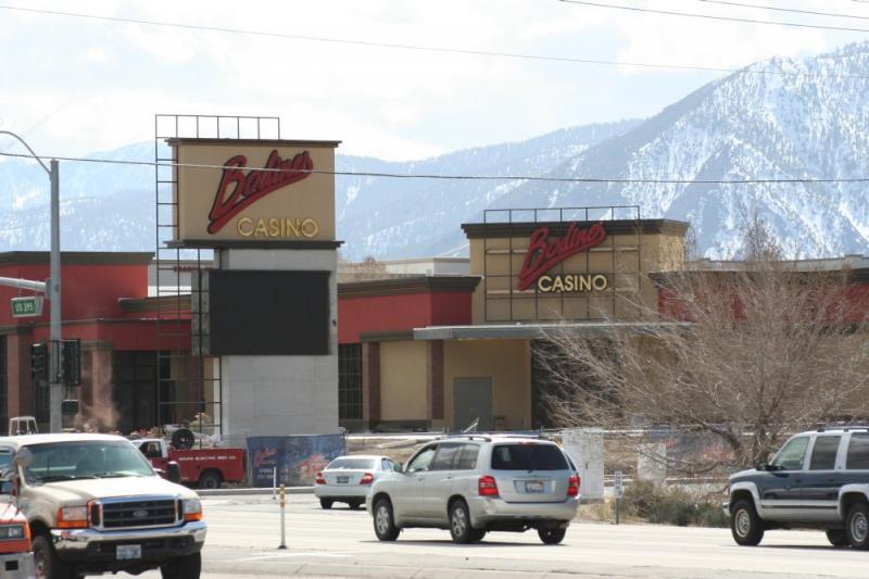
So it looks like the consensus among the commenters is that the new signs that have been put up at Bodines Casino are pretty horrible. They’re too small, they’re not readable, and apparently they don’t even look like what the engineers who designed the building specified.
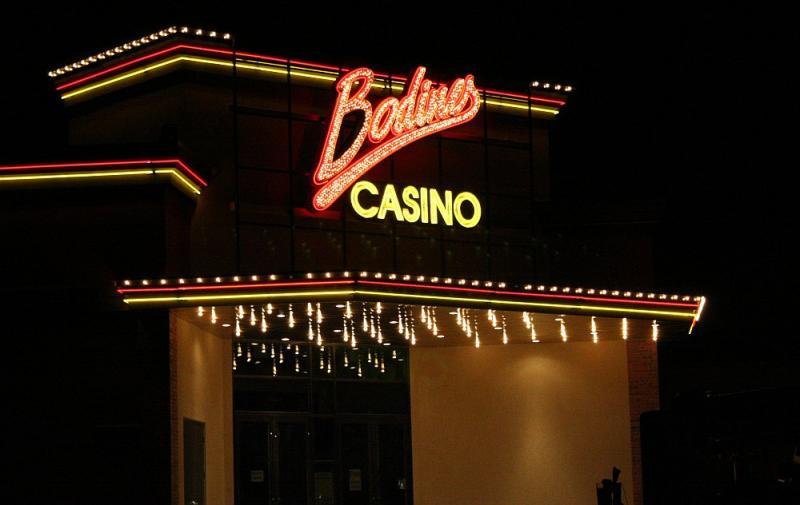
They’ve started lighting the sign up at night, so now we can get a second opinion. How does it look in lights? Does it make you run off the road trying to read it?


Yep, just as hard to read, lights on or off.
The other commenter was right – it does look like “Baldini’s” at first glance.
Pic of Baldini’s sig
Does Bodines have a web site that we can see what?s available for restaurants etc?