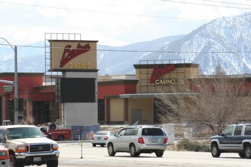
Somehow I thought the words would be bigger, that they’d pop more. But in the last week Bodines Casino has put up their two big signs, the one over the front entrance and the marquee out by the street. The one over the door especially seems about two sizes too small, like it should have at least broken the roof line.


Having owned a sign shop, I was surprised at the design of the signs too. The letters all run together to form a big red blob. Signs should be attractive, but first and foremost, they have to be readable. these signs fail on both counts. A waste of the customer’s money.
I bet that logo looks fantastic in print. Putting it in plastic, though, was probably a bad idea.
Ugh. Definitely hard to read. Is it neon?
I believe it’s neon. I don’t think it’s been lit up at night yet, at least not that I’ve seen.
Seeing the sign for the first time from a distance , I thought it said Baldinies, as in Reno! The font is so close and starts with a B. They should of choose a better font lettering.
I engineered the building and it was supposed to be larger on the building. I don’t know what happened. Maybe the city planners limited the area of all the signs when they applied for the sign permit.
Umm, most of the time when there is a problem with signs, lettering and size? It’s Marvs doing. I BET MARVS V&T SIGN WILL BE SEEN FROM MARS….AND FROM ANYWHERE ON EARTH, WITHOUT NIGHT VISION GOGGLES!