For months we’ve been watching the pillars for the new gateway signs be built, but there hasn’t been a sign in sight. This week, though, the signs finally arrived. At the south end of town, the sign was installed and then quickly shrouded, perhaps waiting for a grand unveiling.
It adds enough mystery to make you wonder just what these signs will look like. I’ve seen lots of concept art for them over the years, some good and some bad. The most recent art I had seen was kind of disappointing, especially in light of some of the previous concepts that had had been floated. But I held out hope that maybe they had at the last minute gone with something a little more compelling.
Then I just happened to be in the north of end town when they were installing that sign, so I got to see the final design, in plain view with no tarps. And it’s exactly like the concept art, and it turns out to be really disappointing. There were a lot of ways they could have gone with the art for this sign, and I suppose it actually could have been more bland than this. But there were a lot of ways that it could have been better, too, and they chose not to go with any of them.
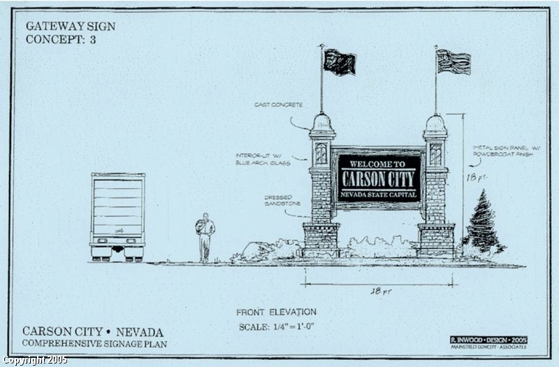
Below are the three concepts that I came across years ago. You can see that Concept #2 is the one they went with, which probably was the least compelling of the three. And somehow, though this is something that seems to happen a lot, the reality as built didn’t quite live up to the promise of the artwork. My favorite of these three has to be the first one. I could see that being an impressive landmark for Carson City. Instead we have what we have. It’s better than the glorified road signs we used to have, certainly, but still far short of what we could have had.
Update: Well, what a surprise. Some wind blew into the area tonight, and lifted the skirts, so to speak, of the sign. The tarp blew right off, revealing the sign before they were ready. Oops! And I accidentally made a u-turn, pulled over, and took a picture. Double oops!


Yep. I saw them outside Custom Sign and Crane shop when dropping my daughter off at school. They were loading them up on the flatbeds. I figured those would be the signs, and I was a bit disappointed. I don’t like the white on blue.
Oh well, they are better than what we had before.
The signs look awesome at night, finnaly a proud indicator of our great city